Mucha Yoga
Ux, Ui, User Research, Web Design
Project Brief
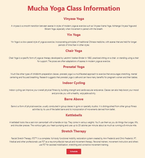
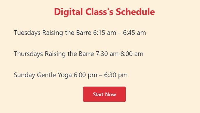
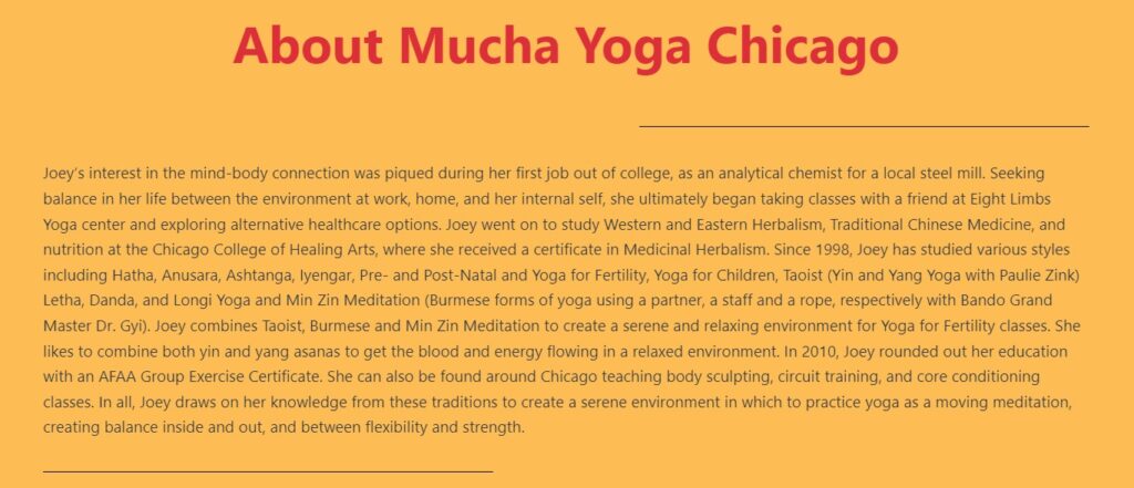
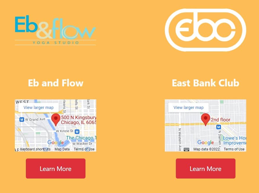
Working with Joey is always a positive experience. Our working relationship started in Chicago, providing updated social and workplace images. In our first conversation about creating her website, the main issue was posting information about potential classes. She needed a way for clients to find all of her available classes and schedule at multiple locations. The initial problem was making sure current clients had an easy way to check updates to her schedule and access class information for each gym that she worked.
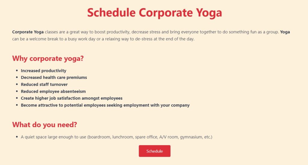
For most of her clients, online access was also heavily on mobile, so making sure that her site was easy to navigate on smaller screen sizes was a main priority of the build. Another necessity was a place to show her updated education and certifications. It was clear a website was needed for high-paying corporate jobs that often requested this information or a website.
Client Problem
- Looking for a way to centralize class information
- Provides services at multiple locations
- Needs logo and branding
- No current website or SEO
- Currently uses gym and studio websites as well as Facebook
- Looking to increase online classes and traffic
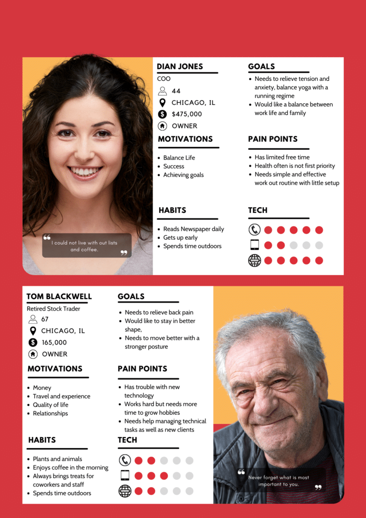
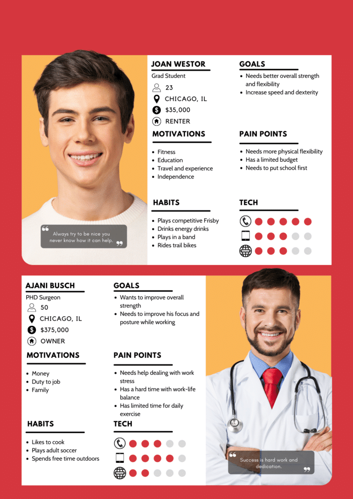
Target User Research
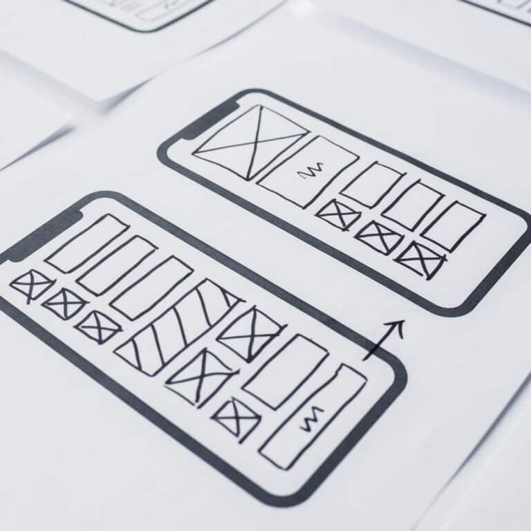
Concept and Brainstorm
Clean and fast design with recognizable brand identity
Increase domain ranking in local search
Provide fast and reliable information for current and future clients
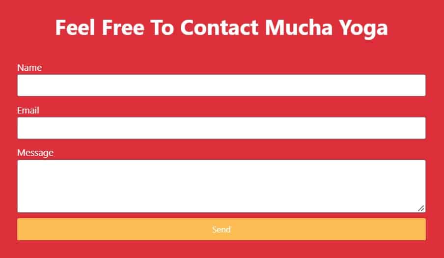
Maintain control over communication and contact information
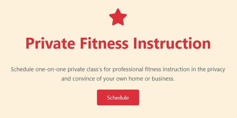
Possible lead generation for private and corporate class’s
Branding and Design
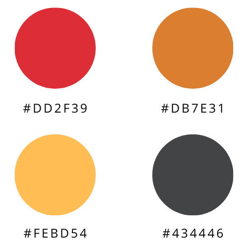
Color Palette
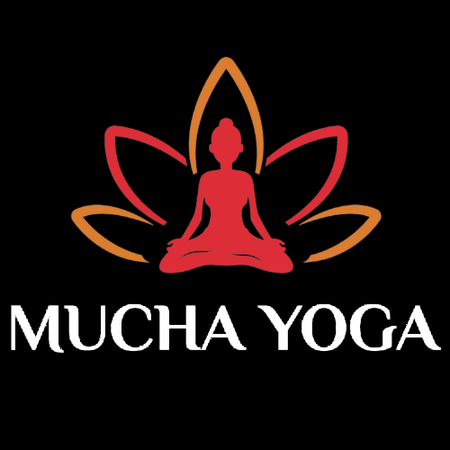
Logo Details
Colors: Red and Orange
Font: Philosopher Bold

Brand Fonts
Header: Montserrat
ABCDEFGHIJKLMNOPQRSTUVWXYZ
abcdefghijklmnopqrstuvwxyz
0123456789!@#$%^&*-+()
Brand Fonts
Body: Cardo
ABCDEFGHIJKLMNOPQRSTUVWXYZ
abcdefghijklmnopqrstuvwxyz
0123456789!@#$%^&*-+()
Logo Variations
The initial concept request for the brand was a to use a feminine icon in design. The client picked the logo colors and brand identity of the sitting lotus as the preferred design. However, it was challenging to find a female silhouette that matched the clients’ needs when looking at potential icons. Therefore, a new icon was illustrated and used to better represent Mucha Yoga’s brand identity to meet the requirements. Below are some of the design options presented for the logo.
Design Solution


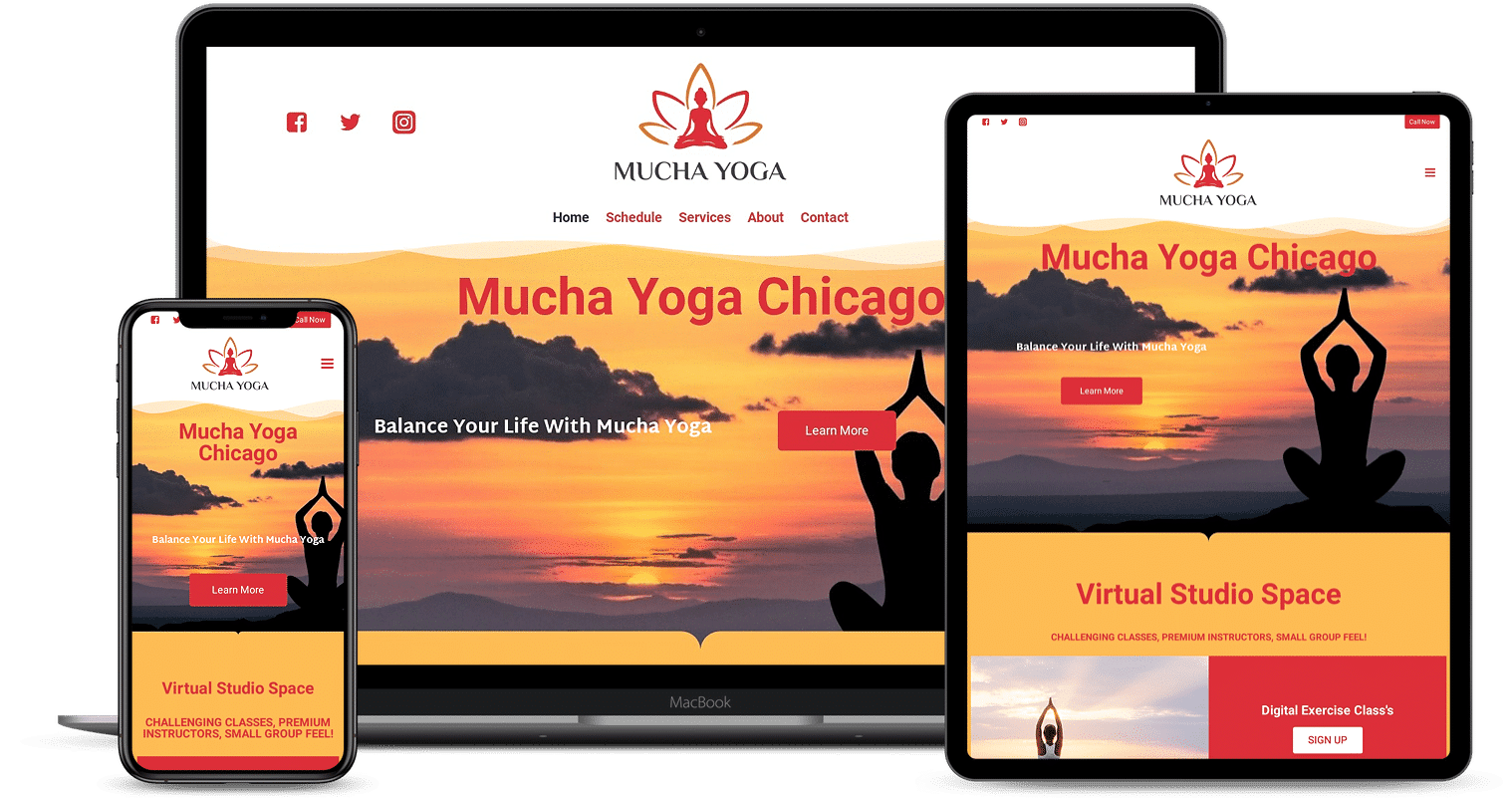
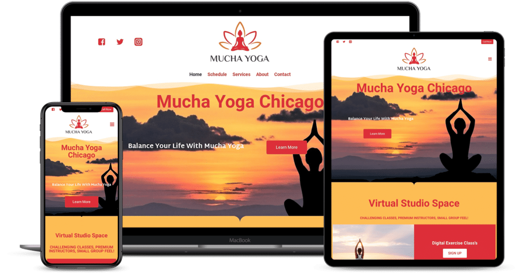
Website Launch
The original build was a much smaller landing page with very minimal information. After a few months, it became clear that this layout worked well for her clients’ current needs. The heatmap showed clear click-through for her traffic to the schedules located on the gym sites. The site’s primary purpose was a single location to funnel her existing clients. There was no need to capture any information or generate any leads.